Most dashboards look nice with colorful charts, but many don’t actually help businesses make decisions. That’s why Power BI dashboard examples are so important as they show how dashboards can turn data into actionable insights. Power BI connects to multiple data sources, updates in real time, and creates interactive visuals, though many businesses still build dashboards they don’t fully use.
Power BI dashboard examples help businesses visualize key metrics like sales, finance, and operations in real time, enabling faster and more accurate decision-making. Read on to learn about some real dashboard examples that actually drive business decisions and what makes the best Power BI dashboards effective. By the end, you’ll know how to design business dashboards that help your team make smarter, faster decisions.
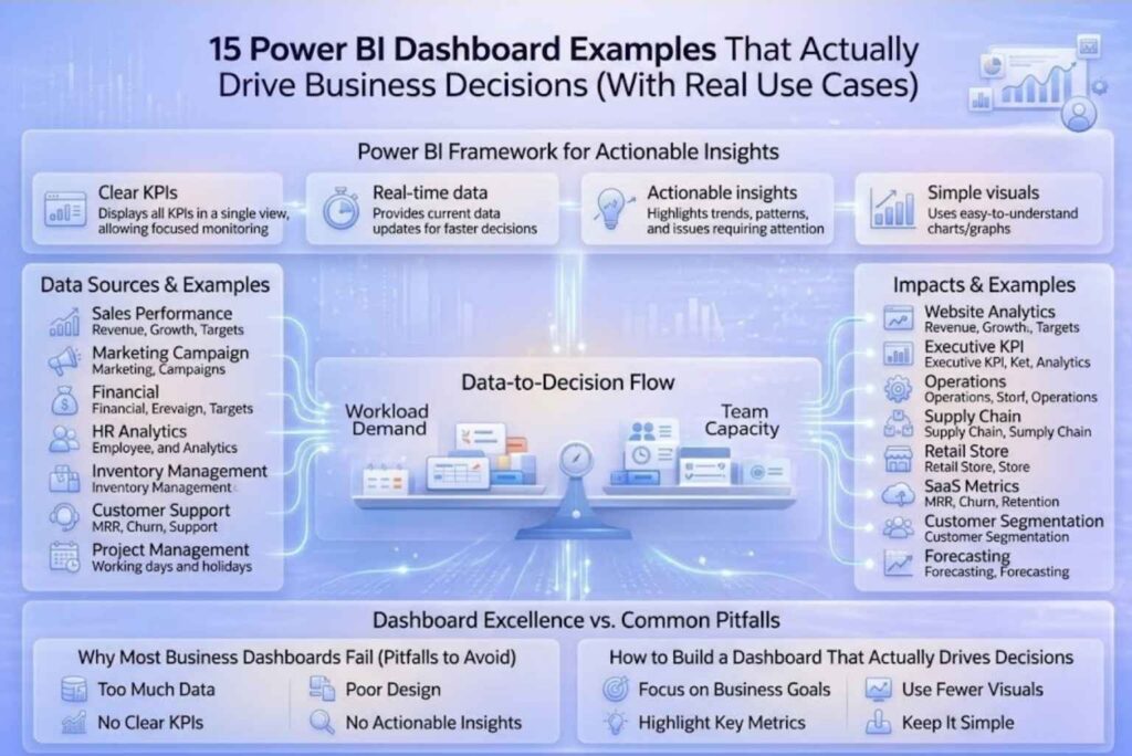
A good Power BI dashboard helps businesses make smarter decisions by presenting data clearly and effectively. Here are the key features that make it useful:
All these elements above ensure that a dashboard not only shows data but also guides meaningful business actions. If you want to understand how to structure your data properly for better reporting, check out our guide on Power BI calendar table and why it’s essential for reporting.
Here are power bi dashboard examples that actually help businesses make better decisions by turning data into actionable insights. Each dashboard focuses on key metrics and shows how teams can respond quickly.
This dashboard tracks revenue, growth, and targets to help sales teams adjust their strategy accordingly. By showing which regions or products are underperforming, it allows managers to make timely decisions and to enhance overall performance.
It displays ROI, cost per click, and conversions, helping marketing teams optimize campaigns. Teams can focus on high-performing campaigns and make data-driven adjustments, improving overall campaign results.
The financial dashboard monitors profit, expenses, and cash flow, making it easier for finance teams to manage budgets. It supports faster decisions and ensures better cost control across the organization.
The HR Analytics Dashboard tracks employee turnover, hiring trends and workforce metrics. This assist HR teams to plan its staffing, rectify retention issues, and improve overall management of the workforce.
It displays stock levels and demand forecasts so that teams can prevent overstock or shortage of products/services. This ensures efficient inventory planning and limiting waste or lost sales.
Customer Support Dashboard tracks tickets, response times, and customer satisfaction in order to help teams improve the overall quality of customer service provided. As a result, support teams can resolve issues faster and enhance the overall customer experience.
Monitors task progress, deadlines, and resource allocation. It keeps projects on track and helps teams meet goals efficiently.
Displays website traffic, bounce rates, and conversions. Marketing teams can use it to improve site performance and increase engagement.
Shows high-level business metrics for leadership. Executives can quickly monitor performance and make informed strategic decisions.
Tracks efficiency and productivity metrics across departments. Teams can identify bottlenecks and improve operational performance.
It helps monitor delivery timelines, vendor performance, and logistics thereby ensuring smooth operations and timely deliveries.
Displays store-wise sales and performance. Managers can identify top-performing stores and address underperforming locations quickly.
Tracks monthly recurring revenue (MRR), churn, and retention. Helps SaaS companies improve customer retention and grow revenue.
Analyzes customer behavior and segments. Marketing teams can create targeted campaigns and improve engagement.
Uses historical data to predict future trends. Businesses can plan ahead and make smarter strategic decisions.
If you’re looking to build scalable and high-performance dashboards for your business, our Business Intelligence & Analytics Services can help you design dashboards that truly drive decisions.
Let’s look at a real-world scenario.
Before using a dashboard, a sales team was stuck with weekly static reports. The data was spread across different spreadsheets and was interpreted differently by team members causing confusion during meetings. Meetings often ended with more questions than answers, and figuring out what to do next felt slow and confusing.
Then they introduced an interactive Power BI dashboard. Suddenly, everything changed. The team could see sales performance in real time, drill down by region or product instantaneously which allowed them to identify issues quickly, make decisions in hours instead of days, and collaborate more efficiently as a team.
In short, the dashboard transformed messy, hard-to-read data into clear, actionable insights. It made the team faster, smarter, and more confident in their decisions.
Dashboards are not just colorful visuals; they are powerful tools that help teams make better decisions. They turn raw data into clear insights, so you can act faster and with confidence.
If you need help building dashboards that actually work, explore our solutions on the Datainseyets or get in touch with our team to create data-driven systems tailored to your business.